Poster of Koichi Sato
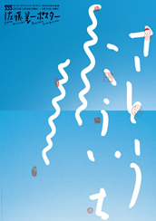
This poster was to advertise the Ginza Graphic Gallery in 2011. It has two pictures of blue sky in the back; he wanted the natural gradation to come out well, so he added Light Cyan to the CMYK setting. He used those stamps and wrote the letters using a marker to not make the poster too serious but to make it more fun and friendly.
Tama University of Arts Master’s Program Gallery 2006
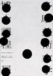
This is a poster he designed for the Tama University of Arts Master’s Program Gallery*. Many people were shocked by this poster because the title of the event should never be blacked out; advertising the event is the whole point of posters. But he made it so that you can still somehow read what it says, and the information you need is written on the bottom left.
He once said that “Typography itself is conservatism, and visual is avant-garde. So once you have a good set of Typography, you can go crazy with the visuals and still be able to communicate through the work.” And this piece is a great example of his philosophy.
*The Tama University of Arts Master’s Program Gallery is for the graduate students to put up their final project.
IdcN
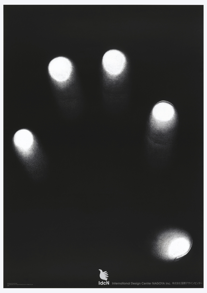
This poster was for the opening of the International Design Center NAGOYA. As you can see, this is an image of a hand, and it only took him a few seconds to make it; he just put his hand on a printer and printed it out. It was the shortest process of all his works, but the most important part was to have a solid concept in mind; he was very particular what he wanted.
His belief is that skills are what makes great design, but in fact, this piece is one of his favorites and it only took him a few seconds to make it. On one of the books he published, he said “Sometimes your work turns out to be a great piece without necessarily working so hard on it and utilizing your skills. And that’s because you have a great concept in mind. But you are only capable of coming up with great concepts because of all the skills you have.”