UNIQULO
UNIQLO is Japanese biggest casual wear brand that was established in 2005, now with its stores in more than 24 countries other than Japan, including the Unites States.
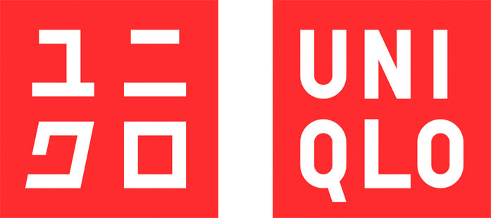
Kashiwa Sato played a huge role in their success story regarding their logo design. So, the right one in the picture down below is the original logo when UNIQLO first launched: with two persons in the red background. But the color slowly became darker over time as they tried to redesign it a couple of times, and after a while the logo changed to the one on the left, with a similar design with their current logo.

Those were designed by other Japanese graphic designers, and when Kashiwa redesigned their logo, he indicated a message for UNIQLO to “look back at where they started and rebuild the brand again.” So he decided to use the same red as the original logo, and refined the typography to have that very neat impression as they do now. And as they released the new logo, they successfully rebrand themselves as a more classic and high-end brand yet still remain its reasonable price.
UNIQLO’s concept is to provide casual and basic yet high quality clothings that people can wear in many various scenes in daily life. Before it was rebranded, people used to not want others to find out that they were wearing UNIQLO. That’s the kind of impression people had about UNIQLO back then, but now it is known for its simple and nicely designed clothes at reasonable prices.

People would know that these pants are from UNIQLO just by looking at the two squares placed next to each other, and that’s how you know their branding has been successful. The less information it takes for people to define a brand, the more successful its branding is.
T-Point card
T-point card is for people to collect points when shopping at TSUTAYA, convenience stores or even online stores now. TSUTAYA is a huge franchise business in Japan that sells and rents books, CDs and DVDs.
When launching a store in Tokyo, Masaaki Masuda, the founder of TSUTAYA asked Kashiwa to design a logo indicating the image of the company in 20 years. And this is what he came out with:

The concept of the logo was “infrastructure.” The “T” image was incorporated to resemble a symbol on a map, making it universal, crossing all boundaries of age, gender and nationality.
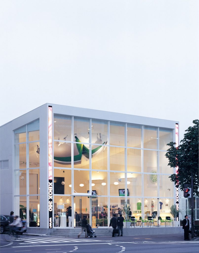
Xbox 360 Cafe
When Xbox 360 came out, a pop-up cafe opened in Tokyo, Japan, and Kashiwa was in charge of its spatial design. He took the whole building as an icon and designed it, said “it is not just logos or products that can be icons for a brand or business but also buildings and cities.”